Friday 17 December 2010

Finished at last!! :)

We have finally completed our music video, CD covers, digi pak, magazine advertisement and the blog. We think that it has been a success, although we faced some up and downs we have enjoyed the filming, the blogging and the editing.

Below is an Image of us all

Thursday 16 December 2010

STORY BOARD

This would be our first scene and we decided that we wanted to have opening credits which
include the name of the artist and song name so that the viewer are aware of the artist/song name


This would show the artist getting ready to out This would show the guy chasing with her girlfriends, we want to show a scene the lead singer in the video
in the bedroom


this would be showing the lead singer singing an dancing , this will be shot in the green screen scree
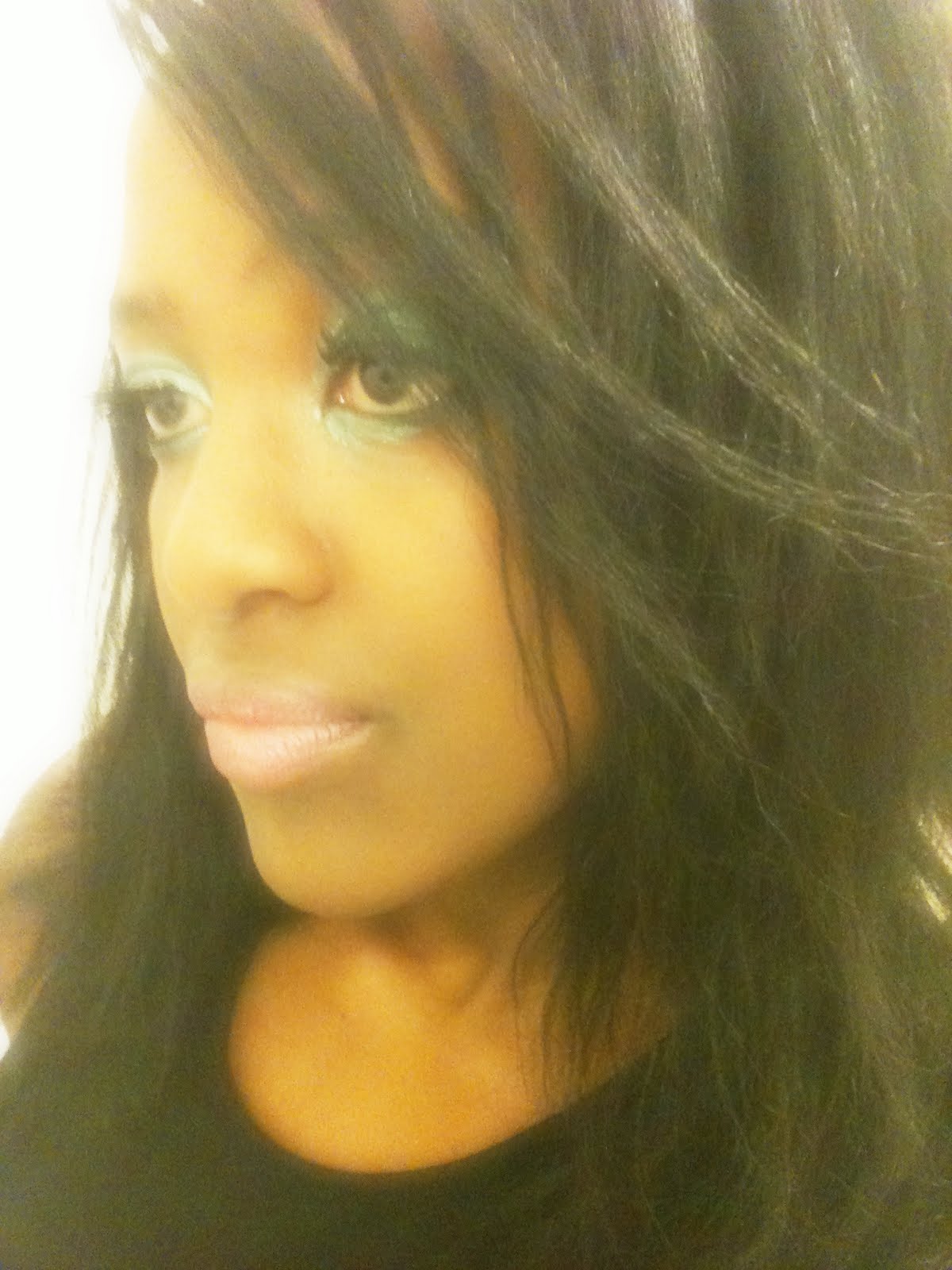
n also showing her with the male character


Because out video is based on performance most of the shot are just going to show the lead singer singing/dancing by herself and with other extra characters in the video. Its also going to include a bit of narrative.
We had more pictures of the first story board but we where facing some difficulties uploading the images, so these are the ones that where able to upload.


Wednesday 15 December 2010

Evaluation 4 - How did you use media technologies in the construction and research, planning and evaluation stages?


Technology played an important part in our music video production and in promoting our music video. To record our music video we used a camera and a tripod, the tripod was useful because when we where filming we wanted our shots to be dead still so that our music video would look more professional. Below are two images of the cameras that we used to film our music video.


The Internet played an important part in planning and researching of our music video, the reason Internet was important is because it allowed us to search for different things such as:
*Examples of CD cover
*Example of Digipaks
*Example of Magazine adverts
*Different genre music
*Images etc
Through YouTube and google we where able research different artist and information that we wanted, if we didn't have the Internet we would had to watch music video on the television and also read books. The Internet helped us understand a greater understanding of modern music videos.


For our editing we used the editing software 'Final Cut Pro' on a Mac Computer which is one of the industries leading video editing programs, it allowed us to edit digital videos with amazing results because with 'Final Cut Pro' you know that your video is going to look just as good on the computer as it does on the camera because its set up to work with standard camera definition as HD.


When we where designing our 'digi pack' and 'magazine covers' we used our own camera to take the pictures. When we edited them we made sure that we used photoshot, which allowed use to air brush, sharpened and edited to make them perfection.


Software

For the creation of the Digi Pack
* Photoshot

For the editing
*Final Cut Pro

Last but not least we used the blogger to update the whole project.

Hardware
Creation of the music video, digipak we used the following:
*A keyboard
*A mouse
*Mac computer
*Camera to take pictures for the digipak/cd cover/magazine advert

For filming
*Camera
*Tripod

Evaluation 3 - What have you learned from your audience feedback?

We just realised that we've already done the audience feedback so go back to 'Audience Feedback' on the blog.

Evaluation 2 - How effective is the combination of your main product and ancillary texts (the magazine advert and CD digipak)?


To make our ancillary texts as realistic as possible we made sure that we did a lot of research in order where us to make it perfect. We made sure that we looked at other CD/Magazine adverts to give us ideas on what we wanted ours to look like. As you can see from other posts that we have posted we did a lot of research, after doing all the research we did we decided that we wanted our CD/Magazine adverts we decided that we wanted to make ours simple but yet effective and eye catching to the audience.

One thing we tried to do looking at everything we did, the video, magazine, advert and CD case is that we tried to vary the colours a little bit but not too much because it’s not a sad music so we don’t want the colouring to be too grey as it affects the song in a different way, but on the other hand we don’t want it to be too colourful either as it bring a different approach of fully joyful to our music which it isn’t either

What we did was like in the music video is use a mixture but we made sure it wasn’t too much. In the video we used a lot of the green screen mainly because we ran out of time before we even really began which set us back a bit. In using the green screen, we had ensured we could use any background we wanted and this will not be too much or too complicated, just something to go with the music, which is why we also used some black and some white backgrounds as well to show he different types of mood through the video. Normally the white background indicates a happy, relaxed mood while the black background will indicate a bad and unwanted mood but instead we chose to play about with it a bit. What we did was while using the black background, the main act was in a happy mood and also dancing, and when the white background came up, she wasn’t over excited but at the same time she wasn’t in a bad mood so it shows that all through the music video the tension was very little and it was more of a relaxed mood and a colour doesn’t always indicate what it’s meant to be, it could be used to indicate a completely different thing in some cases just like our video shows.

Looking at the CD cases, magazines and advert, we went for almost the same type of colouring on each of them to show some continuity and some resemblance. This helps create a product image so as soon as people see’s the colour or the type of font, they will be able to recognise the product immediately. We played about with the font on the advert as well it’s all in the same font but in two different sizes, the most important information are in bold and the rest are on regular font while we also had a quote in italics, to indicate to the customers it’s a quote. The quote has been specially chosen as it would be a psychological advantage as the customer will see “they can’t handle it” and will make them want to buy it and prove they can.

For the back cover we decided to use the protagonist wearing the exact same outfit she was wearing in the music video to make it recognisable from the video.

Looking at the CD cases, magazines and advert, we went for almost the same type of colouring on each of them to show some continuity and some resemblance. This helps create a product image so as soon as people see’s the colour or the type of font, they will be able to recognise the product immediately. We played about with the font on the advert as well it’s all in the same font but in two different sizes, the most important information are in bold and the rest are on regular font while we also had a quote in italics, to indicate to the customers it’s a quote. The quote has been specially chosen as it would be a psychological advantage as the customer will see “


Monday 13 December 2010

Evaluation 1 In what ways does your media product use, develop or challenge forms and conventions of real media products?

We chose to do a R&B song which usualy are about love/relationships. In the music videos there is normally a main female and males singing about each other or to each other. Or if the artist is female the normal conventions of the video will be girl looking glamorous and wearing high fashionable clothes with main props such as phones. If the artist is a male they tend to show guy with his friends and have main props such as cars etc.

Looking at our media video, we had a variety of music videos we chose from and also different genres for example hip hop, R&B etc. But out of all these videos we narrowed them down to only one type which was just R&B and the whole of the music video and every idea we got came from music videos from this genre, especially one video in particular which was 'Easy' by Paula DeAnda. We took almost all our ideas from this video mainly because it perfectly suited the music in which we had chosen, which was Long way to go by Cassie. The music video to Easy is sort of the perfect video to our idea and music we chose in some ways but looking at the choreography and some other things, we had to turn to a variety of Ciara’s music videos for the dance routines for example Like A Boy.

These videos produced us with a very good understanding of how to choreograph the dances in the video and the timing and also gave us some different ideas we hadn’t come up with in the first place. Looking at Ciara’s videos gave us a lot of new ideas and innovation. Although we lost our lead act because of timing and had to change to someone else in the dying minutes, Ciara’s videos shows us that there can be more than one dancers as long as the main act is still going to do a little bit of her own act, this is why we came up with the idea of using people from the dance department.

To do some of the dances in the video and since dancing is what they do, learning the routines and adding to it and dancing it perfectly was a normal thing for them so in a way, losing the lead girl and dancer kind of made it a bit better and easier in a way.

The final video came up with what we had planned, instead of looking at one good video and using it as our idea for the video we looked at different parts of different videos and picked different bits of each to come up with a combination of it all. This helped us a lot as instead of picking one video we thought was good enough but lacking in some areas, we had come up with a way of putting everything together and choosing the best bits of all the videos as u can see from all three videos they are very good but one video is better than the other in a particular way. What I mean is if you look at the Ciara video of Like A Boy, she had the best dancing and choreography but her story line isn’t as good the Proper video of Long Way To Go by Cassie or the story line in Easy by Paula DeAnda. If you look at Paula DeAnda’s video of easy on the other hand, the videos storyline is very good but the dancing and choreography isn’t half as good as Ciara’s Like A Boy. Finally looking at the original video of Long Way To Go by Cassie, she’s got an ok choreography and storyline compared to the two other music video and we couldn’t use a lot of her ideas because since were using her video we wanted a slightly different approach, which lead to the result of our video.

I think our music video for 'Long Way To Go' follows the conventions and stylistics of contemporary music, the narrative of our video consists of a relatioship between a girl and a boy, but our main purpose of the video is to show that there isnt a relationship because the girl is not really interested in the guy she's playing hard to get. As a group we feel that we have given our video our own personal style to it with original narrative and also used slip screen shots, also our CD/Digipack cover challenges the genral conventions of covers for original music videos. The front cover of our CD cover shows the artist and her name and song name is on aswell.

This is all part of the marketing plan to draw in the customers into the product so that they can hopefully fall into the trap of buying the product. Another thing we are looking at a type of psychological pricing, this is using the word ‘only’ and also making sure that whatever the price, it ends in £0.99p, as this shows its under the next price for example buying a meal for only £9.99 or for £10.00, more people will buy the food for £9.99 because the first number they see is 9 instead of 10 so they’ll think it’s less and will go for it when really there’s only a penny difference, this is a major psychological effect on marketing and could help profit a lot more than just normal pricing. Being a consumer myself, I know the way in which buyers think and this is a big way to draw in a lot more customers and sell more products and at the same time for a little bit more while they think it’s for a little bit less so really, it’s a win win situation for the seller.


Saturday 11 December 2010

The team

Below is an image of all of us together :)
Below is an image of Amanda Makubo. Who helped out with most of the thing in the blog, was the main artist and also chose the props that where used in our music video, also helped with the CD covers/inside booklets.


Below is an image of Sherique Brown who was the person who did the editing. She has also helped out with the blog and did most the filming.
Below is an image of Dimeji Ologundudu who helped a bit with the filming, also he has help out with the blog and the magazine cover.

Amanda Makubo

This is a video of Amanda Makubo talking about my role within the group

Sherique Brown

This is a view of Sherique Brown talking about her role within the group.

Dimeji Ologundudu

This is a video of Dimeji Ologundudu who is one of the members in our group. In this video he talks about his role within the group and also explains the things that he has done.


This is an idea we got from a Busta Rhymes video. The picture on the right is a screengrab from the video and the one on the left is a screengrab from the video we produced and the picture on the left is the one from our video. I think this sfx was quite successful considering the limited equipment we had to use. To do this effect we filmed in front a green screen. We had in mind that we would use this sfx but we hadnt clarified which scene we would put it on. While editing, some of the group looked for backgrounds to place on the choma key. We then realised that we had a background that was the exact colour of the jumper she is wearing.


Friday 10 December 2010

The Group

We decided to take a video of ourselves together as a group and spoke the following about our media music video production. We made a video but unfortunately we where unable to upload it to our blog. In the video we where basically talking about the following


1. Who the director was

2. What made us choose the song by Cassie - Long Way To Go

3. How we choose the main lead singer in our music video

4. Most difficult part we faced when putting the music video together

5. Who was in charge of what

We didn't have a director in our group, everyone was in charge and we all contributed to the music video production, so in a way all three of us where directors. The performer was more so directing herself as she knew what she was doing and how to move towards the music that was playing.

The reason why we choose Cassie-Long Way To Go is because we had a vision for the video, soon as we heard the song we pictured it the way we wanted it to be although we didn't include all the things we wanted in the music video we still think it went successful. We come up with possible songs to do such as Ciara-Never Ever Love You which is similar to our chosen song as they are both sang by a female.

The most difficult part we faced when we where making our music video would have to be the timing arrangements we had, we found it difficult to find an appropriate time for us to meet but at the end we ended up finding the right time, at first we thought we would have difficulties with the editing but then realised that one group member of in our group was better and more experience in editing which made things easier for us because individuals had different skills to help with different tasks that we had to do.

Inside Booklet

After we finished researching on some CD albums we got inspired by Rihanna's album 'LOUD' which had inside booklet which basically included a lot of images of her. So after looking at her album we decided that we want to add something extra to it so therefore added the inside booklet. The following images are the images for the inside booklet.


This one here include a lot of mirror images

More pictures for the booklet


Our Digipak

After making our music video we had to move on to making the digipak, because of the research we did we knew exactly what we had to include which made this less difficult to do this. Below is an image of our FRONT COVER of the CD.

FRONT COVER!!

The main focus point for our digipak is the image of the artist, because she’s very important. We put some bright make up to make the image stand out more and used Photoshop to edit and insert text. The main cover of our CD is just a reflection picture of the artist looking into the mirror, we got this idea from the original music video of ‘Cassie-Long way to go’ because in the video she kept looking at herself in the mirror and because we wanted to show that the main focus was on her so we decided that we where going to use it as out front CD COVER. The colour was important in the digipak so we made sure that the text somehow worked with the image. For example for ‘LW2G’ we used brownish/orange font colour to go with the skin colour of the artist. Colour is usually useful in creating meaning, we airbrushed the image to make the image look closer to those of the real media products and also to make the artist appeal more attractive to the audience by emphasising on the flirtatious representation e.g. the artist is biting her lip in some cases this could be seen as sexual representation.

Taking all of this into account none of us are experienced in using Photoshop but I believe that we have done well to make the cover look professional and hopefully have the potential to be used in real media production. We thought carefully about the positions of each features and made sure that this was well structured. We wanted to add ‘limited edition version’ to attract the audience as this describe something exclusive which will therefore encourage the audience to purchase our product because they wouldn’t want to miss anything out, but because we didn’t get the time to do this we were unable to. Our CD is just plain and simple but sexy at the same time and we didn't want to have a lot of things going on.

BACK COVER


The back cover of our CD is just an attractive picture of the artist looking at herself in the mirror reflection of herself with a purple background around her. The front cover allows the audience to see the artists and we decided that for the back cover we wanted to reveals the body of the artist, so therefore there is a link between the front cover and back cover. We felt that our digipak would be more interesting if we kept the background cover the same (purple) because we didn't want to end up using lots of different colours because this would have made our digipak look as if it was targeted to a younger audience. We also used Photoshop for this image and we actually added when we where editing.

Most CD back cover have song titles on the back so we decided that we wanted to do this as well because we want our CD to look as professional as the real ones. As you can see from our back cover it includes the four songs that are in the CD, and kept the text/font simple. The song titles in most CD albums are usually return in small font so we therefore did the same but made sure that the audience/buyer can see the song titles clearly.

INSIDE COVER
For the inside cover we decided to use three similar pictures of our artist, one of her standing in the stairs, one of just her long legs and the last one of her laying in her bedroom, and at the bottom of the image we have included quotes from the song lyrics ''you claim that you so hot and you say you got skills in the BEDROOM'' one reason we chose to put this image of her legs is because her legs are long and since in the video she say to the main guy that he has a long way to go, also because we wanted our cover to be unique we didn't want it to just have images of the artist face only, we wanted to put some of her different body parts which there could make our cover different from the rest.

We also used Photoshop to do this. We put the three pictures together to create one piece of CD cover.

2ND inside cover

The second CD Cover shows two images of the artist and we decided to include the lyrics of the main song in the middle for our buyer. These two images where used because they go with what the lyrics are showing. We wanted to make sure the buyer understands the lyrics and video. These two images show a confident girl who is used to guys asking her out but she doesn't think any of them are good for her, these images stand out because the artist looks confident and the way the pictures are positioned goes well with the whole thing.

This is how are work looks like at the moment

FRONT COVER INSIDE COVER
INSIDE COVER BACK COVER

Magazine Advertisement Evaluation


We had to design and produce our own magazine advertisement for the release of our digipak, to do this we had to do some research on magazine advertisement which we did and I wrote about it on the previous post that I posted. While I was doing my research I realised that they usually use the image from the album cover on the magazine advertisement to allow the audience to notice it/see that it’s the same artist, but we have decided that the image that we are going to put on the magazine advertisement will be used for the back cover instead of the front. This is an image of our magazine advertisement, and we made sure that it was more eye catching for the audience. Below is an image of our magazine advertisement cover.


To make our magazine advertisement stand out we used black/white and grey font colour which matches the artists outfit that she is wearing. The main focus on this is the image and the artists name and song name ‘Cassie-Long Way To Go’ and this is why we put the name/title of the song on top of the picture because we wanted it to be the main focus. We used white highlight on ‘Long way to go’ (which is the title of the song) because we wanted it to stand out more to the audience.

While I was analysing other existing magazine advertisements covers I noticed that some of them use quotes and put them on the magazine so we decided to do that as well by adding a quote from the original song ‘’they can’t handle me’’. We name sure that we included the information on when the CD was out and even included a website that the buy/reader can visit if they need more information on the artist. To create this poster we used Photoshop although none of our group members knew how to use it we had to teach ourselves.

So far I think that this magazine cover is successful because it includes all the important information that the audience needs, we made sure that there was at least some kind of link between the magazine and digipak for example the link through the costume, if you notice clearly on most of our pictures the artist is wearing the same black and white heels. We wanted to keep something the same so we decided to use the shoes.

So overall the magazine advertisement works well in promoting the album for the digipak. We feel as if we have targeted our product well to appeal to our target audience, by costume, font of the magazine and also using bright interesting colours that are eye catching. However looking at our final piece of work we do feel that there are some changes that could be made for example, adding less words, making the magazine less brighter.

Thursday 9 December 2010

Magazine Advertisement Analysis


So for the other part of our promotional package we are going to produce a magazine advertisement. Therefore we have to think carefully of the things that we are going to include in the magazine advertisement and make sure that this reaches to our target audience. I have looked at different magazine advertisement covers by famous artists to get some ideas and inspiration for our magazine advertisement cover for our music video/song. I've looked at one of Ciara's magazine advertisement.


Looking at this magazine advertisement we can see that the background for it is pink which is quite eye catching to the audience and girlie but can also appeal to a male audience because of her sex appeal. Her lipstick also matches with the background. She's wearing a sexy black and white outfit which also matches with the writing/fonts of the magazine. You can tell that the person who made this thought about what they wanted in the magazine and did a lot of preparations for it. They have thought about what font to use and where to put it, which gives us and idea on what we might want on our magazine advertisement.

What I love about this magazine is that there is a lot going on e.g. a lot of writing but they have made it work. I like how they matched together her outfit colour with the font colour and how the lipstick matches with the background. Although out the cover they have kept it with the same font and also included the artists name which is very important.

Looking at another Ciara Magazine cover, now this cover is totally different from the previous one that i just finished talking about, as we can see on this one it is more plain and simple but very colourful and it immediately catches the audiences eyes. I love how they used the Caribbean colours which sort of gives it a kind of Jamaican feeling to it (red, green and yellow). Ciara's name is on the top next to her picture and below it is a heart with the letter 'c' which in my opinion i think that its saying 'love Ciara' I love the fact that the cover is dark but bright at the same time which makes it eye catching to the audience

Audience Feedback

So we decide to get audience feedback on our music video to see what people thought about it, what they liked, changes that they think we should make and what they thought about the music video overall. These are the following question that i asked.

1. What did you think of our music video so far?

2. Was it easy to understand what was going on in the music video?

3. Are there any changes that you think we could have made/improvements?


We asked this person the questions about our music video so far. This person said that our music video was easy to understand but he couldn't really tell whether the guy that the main artist was dancing with what he was doing because he thought that he was not acting according to what the main artist was saying. He also said that he thinks the the changes that we could make would probarly br claring up the lines in the video of the shots we did on the green screen.


He thought that the music video was good and liked the opening titles we used, he also liked the transections, fast face of the video and felt that the lip syncing was on time and fit the music video perfectly. The changes he felt we could make was to take more shots outside instead of having most of it done in the green screen.


He also enjoyed our music video and thought that the main girl performed her role good and the storyline and thought that we put together our music video well, also he could tell that a lof of effect has been put. Felt it was easy to understand and structured well. So overall the music video is good but said that we could have filmed in more different sets instead of filming most of it in the green screen


He thought it was agood and liked the concept of it, found it easy to understand the plot and could follow the story and thought it was put together well. He said that he thought we could have used different locations to make the video look a bit more interestin, also said that we used to much green screen, but thought that the music video was good overall and he enjoyed.


So basically overall the majority of people we have asked about our music video have told us that they enjoyed the music video and understood the storyline. A lot of these people did mention that we should have used more locations which we as a group agree with as well. So if we where to make changes we would use more locations, used more different props and also make the plot more clearer to the audience. From the audience feedback we have learned our music video is good to a certain extend, the majority of people we interviewed liked the lead singers performance and the only thing that they didn't like is the fact that most of the filming was done in the green screen, so if where to make any changes towards our video we would film in more locations to make it more interesting to the audience. Getting audience feed back is very useful as it gives us and idea on what people expect from the music video and gives us their different views which is helpful.

After talking to various other groups within our media class and found out that one of the most favoured shots within our production was the split screen scene. Other people said that their most interesting features of our video production was the use of the written lyrice ''my boots my bags''.

Also found out that costume was essential for our viewers, the audience seen to have liked the costumes that we used.

Wednesday 8 December 2010

Rihanna's Inside Booklet cover for LOUD Album

Inside Booklet
Additional feature to the album is a 11 booklet placed inside the case. Looking at the following on Rihanna’s ‘Loud’ Album include large amount of photographs of Rihanna, all with different themes which are related to the songs that are listed on the album. I think because the booklets are unseen by the buyer before they purchase the album it makes it more desirable to buy, which gives us an idea to maybe do something like this if we get the time. Looking at these images most of them are just images of Rihanna with quotes in them which could be appealing to the buyer.


Tuesday 7 December 2010

Digipack Analysi

So first things first, I've started researching into Digipaks. First im going to analyse an existing Digipaks and music albums looking at the different features as a whole, which will therefore successful and she has been receiving a lot of awards including one for one of the worlds best selling female artist. The album ‘Loud’ is her fifth studio album released November 12, 2010 on Def Jam Recordings. Her album ‘Loud’ entered number 3 on the US Billboard 200 chart, selling more then 200,000 copies in the albums first week in the United States. ‘Only Girl’ and ‘What’s My Name’ these two songs both become number one hits in the US.

The album I'm going to be looking at is ‘Loud’ by a well known female artist Rihanna. Rihanna is a Barbadian R&B recording artist, she started her career in 2005 with her first album called ‘Music of the Sun’ later on the years her carreer has become HUGE and is now one of the best female artist out. Rihanna's album ‘Loud’ incorporates pop and dance-pop to offer that up tempo/sing along and also club oriented songs.

NEW Album COVER!
Rihanna's New Album COVER!!


Rihanna's Previous Album COVER!!
Rated R'


Looking at the from cover, it focuses mainly on the genre of pop and dance pop introducing her new image as from her previously album ‘Rated R’ it was more of a rock image. Looking at these two album covers we can see that her previous album ‘Rated R’ s rock image is created by the dark theme of the cover including her wearing a gothic costume and a font of the letter ‘R’ written in the top right hand cover of the album. Looking at her new album cover ‘Loud’ is more of a pop/dance genre and this is shown through the bright colour of her hair and lipstick which gives it that fun feeling. The most noticeable feature of the ‘Rated R’ album cover is the black and white head shot of Rihanna in a moody kind of pose. Her right hand is covering her right eye and her left eye is covered by thick black eye liner. Looking at ‘Loud’ album cover shows the position of the artist represents her as vulnerable but however her facial expression looks fierce, although she is not looking directly at the audience, the image is still engaging, also because her hair and lipstick are the brightest section of the cover it gives her a pop look.

The album cover doesn’t have the artists name and this suggests that she is a well known worldwide singer therefore her name doesn’t need to be include this suggest that everyone knows her, so the audience only need to know the name of the album. The title of the album is written down the bottom in white with spacing between each of the letters. The title has been displayed in white font so that it can be clear to see.

Through analysing this cover I’ve learnt that there is a relationship between meaning in the cover and the songs that it features, by looking at the cover it gives the audience a feel of the genre of the album, also I’ve realised that the cover isn’t like normal cover, because usually album covers include the artists name but this one doesn’t but it does include the image of the artist and the name of the album which is important.

Back COVER of 'LOUD' ALBUM

The back of the album cover shows some characteristic of pop/dance music it shows Rihanna wearing a small black and white top and bra showing looking straight towards the audience. Her bright hair brightens the whole cover, this cover shows her calm and chilled out and she looks fierce edgy and very sexy at the same time. The back cover lists what songs are included in the album with other artists who are also featured in the songs but the features names are smaller, the font is the same as the font used for the album’s title on the front cover. The names of the songs start at the top left going down its more direct to the audience, for example you would really look at the bottom right and then look at the top, it wouldn’t be appealing to the audience.

Below the listed song titles are the names of the Executive/Co-Executive Producers in the font smaller than the song title which gives me an idea on what I need to include on my back cover of my music video. This is there to show the buyer the people are actually in charge of the production of the album because usually they don’t get much recognition so therefore this is used to show them some recognition. On the bottom left of the album there are a few websites listed e.g. www.DEFJAM.com The record label, where the album was made etc. I did some research and found out that “this feature of the back cover is not made to be noticeable but it is there as protection for the company. If anyone tries to copy or illegally sell the album the copyright states there are consequences usually resulting in fines. The information covers the record label and artist for copyright and acts as proof that the audience has been warned even if it is being done subtly, similar to small print on a contract.”

On the right hand side of the back cover they have included a symbol for their record label which is something that I didn’t think about, so therefore now I’m thinking we can make up a logo for our album cover. I did some more research and found out that things about recycling symbols and barcodes but I don’t really know much about it to talk about it so therefore I have to do some more research into it.

I was planning on analysing the disk cover as well because usually different Cds have different disk cover, for example sometimes they would include a picture on the disk and include some writing. I was unable to find images of the disk cover for Rihanna’s ‘Loud’ Album so therefore I wont be able to analyse it. Here are some images from her album.